We will look at various CSV files in the ‘school’ folder. Each one of these csv files contain information on NYC high schools. We will clean the datasets and condense it into one dataframe. The data cleaning process was done in the missions, so we’ll quickly repeat the process in this notebook and focus on the data analysis.
1
2
3
4
5
6
7
8
9
10
11
12
13
14
15
16
17
18
19
| import pandas
import numpy
import re
import matplotlib
data_files = [
"ap_2010.csv",
"class_size.csv",
"demographics.csv",
"graduation.csv",
"hs_directory.csv",
"sat_results.csv"
]
data = {}
for f in data_files:
d = pandas.read_csv("schools/{0}".format(f))
data[f.replace(".csv", "")] = d
|
Read in the surveys
1
2
3
4
5
6
7
8
9
10
11
12
13
14
15
16
17
18
19
20
21
22
23
24
25
26
27
28
29
30
31
32
33
| all_survey = pandas.read_csv("schools/survey_all.txt", delimiter="\t", encoding='windows-1252')
d75_survey = pandas.read_csv("schools/survey_d75.txt", delimiter="\t", encoding='windows-1252')
survey = pandas.concat([all_survey, d75_survey], axis=0)
survey["DBN"] = survey["dbn"]
survey_fields = [
"DBN",
"rr_s",
"rr_t",
"rr_p",
"N_s",
"N_t",
"N_p",
"saf_p_11",
"com_p_11",
"eng_p_11",
"aca_p_11",
"saf_t_11",
"com_t_11",
"eng_t_10",
"aca_t_11",
"saf_s_11",
"com_s_11",
"eng_s_11",
"aca_s_11",
"saf_tot_11",
"com_tot_11",
"eng_tot_11",
"aca_tot_11",
]
survey = survey.loc[:,survey_fields]
data["survey"] = survey
|
Add DBN columns
1
2
3
4
5
6
7
8
9
10
11
| data["hs_directory"]["DBN"] = data["hs_directory"]["dbn"]
def pad_csd(num):
string_representation = str(num)
if len(string_representation) > 1:
return string_representation
else:
return "0" + string_representation
data["class_size"]["padded_csd"] = data["class_size"]["CSD"].apply(pad_csd)
data["class_size"]["DBN"] = data["class_size"]["padded_csd"] + data["class_size"]["SCHOOL CODE"]
|
Convert columns to numeric
1
2
3
4
5
6
7
8
9
10
11
12
13
14
15
16
17
18
19
20
21
| cols = ['SAT Math Avg. Score', 'SAT Critical Reading Avg. Score', 'SAT Writing Avg. Score']
for c in cols:
data["sat_results"][c] = pandas.to_numeric(data["sat_results"][c], errors="coerce")
data['sat_results']['sat_score'] = data['sat_results'][cols[0]] + data['sat_results'][cols[1]] + data['sat_results'][cols[2]]
def find_lat(loc):
coords = re.findall("\(.+, .+\)", loc)
lat = coords[0].split(",")[0].replace("(", "")
return lat
def find_lon(loc):
coords = re.findall("\(.+, .+\)", loc)
lon = coords[0].split(",")[1].replace(")", "").strip()
return lon
data["hs_directory"]["lat"] = data["hs_directory"]["Location 1"].apply(find_lat)
data["hs_directory"]["lon"] = data["hs_directory"]["Location 1"].apply(find_lon)
data["hs_directory"]["lat"] = pandas.to_numeric(data["hs_directory"]["lat"], errors="coerce")
data["hs_directory"]["lon"] = pandas.to_numeric(data["hs_directory"]["lon"], errors="coerce")
|
Condense datasets
1
2
3
4
5
6
7
8
9
10
11
12
| class_size = data["class_size"]
class_size = class_size[class_size["GRADE "] == "09-12"]
class_size = class_size[class_size["PROGRAM TYPE"] == "GEN ED"]
class_size = class_size.groupby("DBN").agg(numpy.mean)
class_size.reset_index(inplace=True)
data["class_size"] = class_size
data["demographics"] = data["demographics"][data["demographics"]["schoolyear"] == 20112012]
data["graduation"] = data["graduation"][data["graduation"]["Cohort"] == "2006"]
data["graduation"] = data["graduation"][data["graduation"]["Demographic"] == "Total Cohort"]
|
Convert AP scores to numeric
1
2
3
4
| cols = ['AP Test Takers ', 'Total Exams Taken', 'Number of Exams with scores 3 4 or 5']
for col in cols:
data["ap_2010"][col] = pandas.to_numeric(data["ap_2010"][col], errors="coerce")
|
Combine the datasets
1
2
3
4
5
6
7
8
9
10
11
12
| combined = data["sat_results"]
combined = combined.merge(data["ap_2010"], on="DBN", how="left")
combined = combined.merge(data["graduation"], on="DBN", how="left")
to_merge = ["class_size", "demographics", "survey", "hs_directory"]
for m in to_merge:
combined = combined.merge(data[m], on="DBN", how="inner")
combined = combined.fillna(combined.mean())
combined = combined.fillna(0)
|
Add a school district column for mapping
1
2
3
4
| def get_first_two_chars(dbn):
return dbn[0:2]
combined["school_dist"] = combined["DBN"].apply(get_first_two_chars)
|
Find correlations
1
2
3
| correlations = combined.corr()
correlations = correlations["sat_score"]
print(correlations)
|
1
2
3
4
5
6
7
8
9
10
11
12
13
14
15
16
17
18
19
20
21
22
23
24
25
26
27
28
29
30
31
32
33
34
35
36
37
38
39
40
41
42
43
44
45
46
47
48
49
50
51
52
53
54
55
56
57
58
59
60
61
62
| SAT Critical Reading Avg. Score 0.986820
SAT Math Avg. Score 0.972643
SAT Writing Avg. Score 0.987771
sat_score 1.000000
AP Test Takers 0.523140
Total Exams Taken 0.514333
Number of Exams with scores 3 4 or 5 0.463245
Total Cohort 0.325144
CSD 0.042948
NUMBER OF STUDENTS / SEATS FILLED 0.394626
NUMBER OF SECTIONS 0.362673
AVERAGE CLASS SIZE 0.381014
SIZE OF SMALLEST CLASS 0.249949
SIZE OF LARGEST CLASS 0.314434
SCHOOLWIDE PUPIL-TEACHER RATIO NaN
schoolyear NaN
fl_percent NaN
frl_percent -0.722225
total_enrollment 0.367857
ell_num -0.153778
ell_percent -0.398750
sped_num 0.034933
sped_percent -0.448170
asian_num 0.475445
asian_per 0.570730
black_num 0.027979
black_per -0.284139
hispanic_num 0.025744
hispanic_per -0.396985
white_num 0.449559
...
rr_p 0.047925
N_s 0.423463
N_t 0.291463
N_p 0.421530
saf_p_11 0.122913
com_p_11 -0.115073
eng_p_11 0.020254
aca_p_11 0.035155
saf_t_11 0.313810
com_t_11 0.082419
eng_t_10 NaN
aca_t_11 0.132348
saf_s_11 0.337639
com_s_11 0.187370
eng_s_11 0.213822
aca_s_11 0.339435
saf_tot_11 0.318753
com_tot_11 0.077310
eng_tot_11 0.100102
aca_tot_11 0.190966
grade_span_max NaN
expgrade_span_max NaN
zip -0.063977
total_students 0.407827
number_programs 0.117012
priority08 NaN
priority09 NaN
priority10 NaN
lat -0.121029
lon -0.132222
Name: sat_score, dtype: float64
|
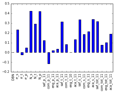
We are interested the correlations with the columns specified in survey_fields.
1
2
3
| %matplotlib inline
correlations[survey_fields].plot.bar()
|
1
| <matplotlib.axes._subplots.AxesSubplot at 0x7fb21f69bcc0>
|
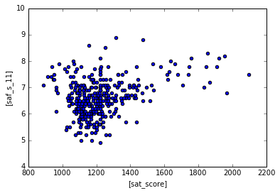
The saf_s_11 column measures how students perceive safety at the school, let’s see how students do in the SATs if the schools have higher safety scores.
1
| combined.plot.scatter(['sat_score'], ["saf_s_11"])
|
1
| <matplotlib.axes._subplots.AxesSubplot at 0x7fb21f683208>
|
Looks like there is a weak positive correlation between safety and SAT scores. Maybe it is easier for students to study when they are not worried about safety.
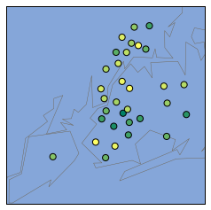
We can generate a NYC basemap and see which schools have lower safety scores, and color label the schools with lower safety scores with a different color
1
2
3
4
5
6
7
8
9
10
11
12
13
14
15
16
17
18
19
20
21
22
23
24
25
| import matplotlib.pyplot as plt
from mpl_toolkits.basemap import Basemap
districts = combined.groupby("school_dist").agg(numpy.mean)
districts.reset_index(inplace=True)
m = Basemap(
projection='merc',
llcrnrlat=40.496044,
urcrnrlat=40.915256,
llcrnrlon=-74.255735,
urcrnrlon=-73.700272,
resolution='i'
)
m.drawmapboundary(fill_color='#85A6D9')
m.drawcoastlines(color='#6D5F47', linewidth=.4)
m.drawrivers(color='#6D5F47', linewidth=.4)
#converts to list
longitudes = districts['lon'].tolist()
latitudes = districts['lat'].tolist()
#generates a scatterplot with the 2 lists as arguments, s=20 for size of points, zorder=2 for dots on top of the map, latlong=True to indicate we are putting in the latitude/longitude
m.scatter(longitudes, latitudes, s=50, zorder=2, latlon=True, c=districts['saf_s_11'], cmap='summer')
plt.show()
|
1
2
3
4
5
| <class 'pandas.core.frame.DataFrame'>
Int64Index: 363 entries, 0 to 362
Columns: 160 entries, DBN to school_dist
dtypes: float64(51), int64(16), object(93)
memory usage: 456.6+ KB
|
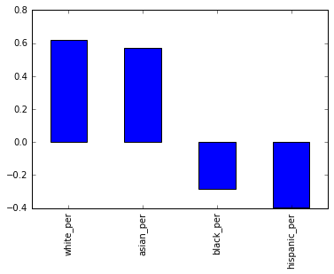
Next we are interested to see if there is a correlation between race and SAT scores.
1
2
3
4
5
6
7
8
| races = [
'white_per',
'asian_per',
'black_per',
'hispanic_per',
]
correlations[races].plot.bar()
|
1
| <matplotlib.axes._subplots.AxesSubplot at 0x7fb21fd2e278>
|
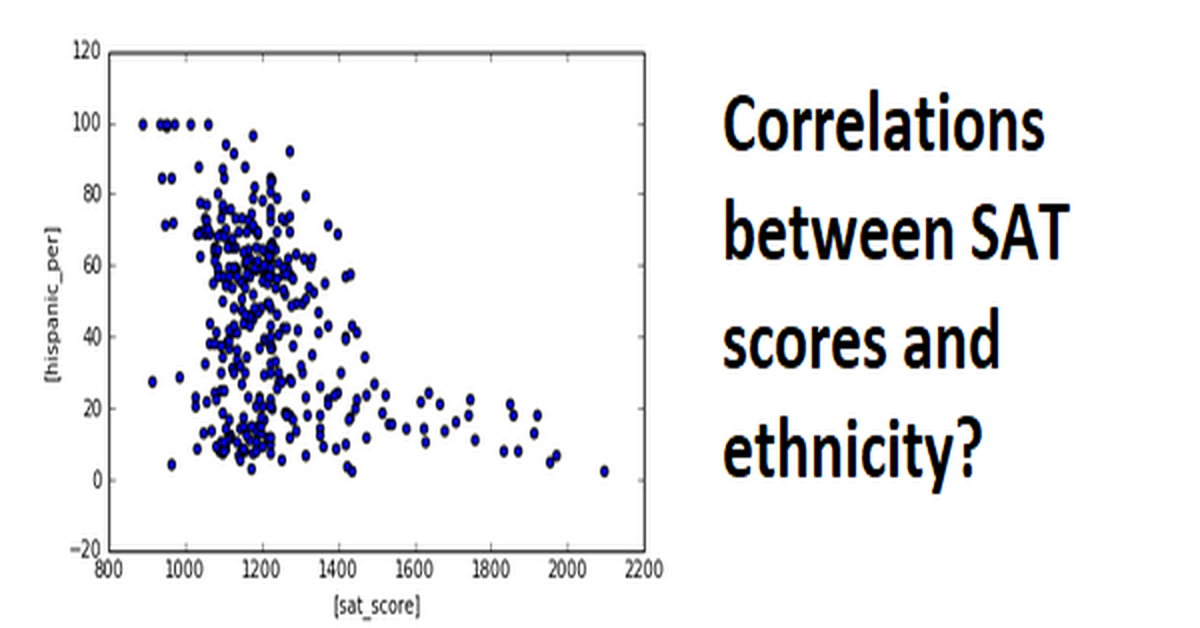
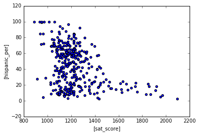
We are seeing positive correlation for whites/asians in SAT scores, negative correlations for blacks/hispanic in SAT scores. However, I wouldn’t say any of these correlations are very strong. Let’s use a scatter plot for hispanic to see if we can draw any insights.
1
| combined.plot.scatter(['sat_score'], ["hispanic_per"])
|
1
| <matplotlib.axes._subplots.AxesSubplot at 0x7fb21fd40898>
|
Schools with high amount of hispanics do poorly in the SATs. Schools with low amount of hispanics can do relatively well in the SATs. Let’s filter the data down to scools with >95% Hispanics
1
2
| schools_with_hispanics = combined[combined['hispanic_per'] > 95]
schools_with_hispanics
|
| DBN | SCHOOL NAME | Num of SAT Test Takers | SAT Critical Reading Avg. Score | SAT Math Avg. Score | SAT Writing Avg. Score | sat_score | SchoolName | AP Test Takers | Total Exams Taken | ... | priority05 | priority06 | priority07 | priority08 | priority09 | priority10 | Location 1 | lat | lon | school_dist |
|---|
| 44 | 02M542 | MANHATTAN BRIDGES HIGH SCHOOL | 66 | 336.0 | 378.0 | 344.0 | 1058.0 | Manhattan Bridges High School | 67.000000 | 102.000000 | ... | 0 | 0 | 0 | 0 | 0 | 0 | 525 West 50Th Street\nNew York, NY 10019\n(40.... | 40.765027 | -73.992517 | 02 |
|---|
| 82 | 06M348 | WASHINGTON HEIGHTS EXPEDITIONARY LEARNING SCHOOL | 70 | 380.0 | 395.0 | 399.0 | 1174.0 | 0 | 129.028846 | 197.038462 | ... | Then to New York City residents | 0 | 0 | 0 | 0 | 0 | 511 West 182Nd Street\nNew York, NY 10033\n(40... | 40.848879 | -73.930807 | 06 |
|---|
| 89 | 06M552 | GREGORIO LUPERON HIGH SCHOOL FOR SCIENCE AND M... | 56 | 339.0 | 349.0 | 326.0 | 1014.0 | GREGORIO LUPERON HS SCI & MATH | 88.000000 | 138.000000 | ... | 0 | 0 | 0 | 0 | 0 | 0 | 501 West 165Th\nNew York, NY 10032\n(40.838032... | 40.838032 | -73.938371 | 06 |
|---|
| 125 | 09X365 | ACADEMY FOR LANGUAGE AND TECHNOLOGY | 54 | 315.0 | 339.0 | 297.0 | 951.0 | Academy for Language and Technology | 20.000000 | 20.000000 | ... | 0 | 0 | 0 | 0 | 0 | 0 | 1700 Macombs Road\nBronx, NY 10453\n(40.849102... | 40.849102 | -73.916088 | 09 |
|---|
| 141 | 10X342 | INTERNATIONAL SCHOOL FOR LIBERAL ARTS | 49 | 300.0 | 333.0 | 301.0 | 934.0 | International School for Liberal Arts | 55.000000 | 73.000000 | ... | 0 | 0 | 0 | 0 | 0 | 0 | 2780 Reservoir Avenue\nBronx, NY 10468\n(40.87... | 40.870377 | -73.898163 | 10 |
|---|
| 176 | 12X388 | PAN AMERICAN INTERNATIONAL HIGH SCHOOL AT MONROE | 30 | 321.0 | 351.0 | 298.0 | 970.0 | 0 | 129.028846 | 197.038462 | ... | 0 | 0 | 0 | 0 | 0 | 0 | 1300 Boynton Avenue\nBronx, NY 10472\n(40.8313... | 40.831366 | -73.878823 | 12 |
|---|
| 253 | 19K583 | MULTICULTURAL HIGH SCHOOL | 29 | 279.0 | 322.0 | 286.0 | 887.0 | Multicultural High School | 44.000000 | 44.000000 | ... | 0 | 0 | 0 | 0 | 0 | 0 | 999 Jamaica Avenue\nBrooklyn, NY 11208\n(40.69... | 40.691144 | -73.868426 | 19 |
|---|
| 286 | 24Q296 | PAN AMERICAN INTERNATIONAL HIGH SCHOOL | 55 | 317.0 | 323.0 | 311.0 | 951.0 | 0 | 129.028846 | 197.038462 | ... | 0 | 0 | 0 | 0 | 0 | 0 | 45-10 94Th Street\nElmhurst, NY 11373\n(40.743... | 40.743303 | -73.870575 | 24 |
|---|
8 rows × 160 columns
Let’s filter the data to see the schools with low hispanics AND high SAT scores.
1
2
3
| schools_with_lh = combined[(combined['hispanic_per'] < 10) &
(combined['sat_score'] > 1800)]
schools_with_lh
|
| DBN | SCHOOL NAME | Num of SAT Test Takers | SAT Critical Reading Avg. Score | SAT Math Avg. Score | SAT Writing Avg. Score | sat_score | SchoolName | AP Test Takers | Total Exams Taken | ... | priority05 | priority06 | priority07 | priority08 | priority09 | priority10 | Location 1 | lat | lon | school_dist |
|---|
| 37 | 02M475 | STUYVESANT HIGH SCHOOL | 832 | 679.0 | 735.0 | 682.0 | 2096.0 | STUYVESANT HS | 1510.0 | 2819.0 | ... | 0 | 0 | 0 | 0 | 0 | 0 | 345 Chambers Street\nNew York, NY 10282\n(40.7... | 40.717746 | -74.014049 | 02 |
|---|
| 151 | 10X445 | BRONX HIGH SCHOOL OF SCIENCE | 731 | 632.0 | 688.0 | 649.0 | 1969.0 | BRONX HS OF SCIENCE | 1190.0 | 2435.0 | ... | 0 | 0 | 0 | 0 | 0 | 0 | 75 West 205 Street\nBronx, NY 10468\n(40.87705... | 40.877056 | -73.889780 | 10 |
|---|
| 187 | 13K430 | BROOKLYN TECHNICAL HIGH SCHOOL | 1277 | 587.0 | 659.0 | 587.0 | 1833.0 | BROOKLYN TECHNICAL HS | 2117.0 | 3692.0 | ... | 0 | 0 | 0 | 0 | 0 | 0 | 29 Ft Greene Place\nBrooklyn, NY 11217\n(40.68... | 40.688107 | -73.976745 | 13 |
|---|
| 327 | 28Q687 | QUEENS HIGH SCHOOL FOR THE SCIENCES AT YORK CO... | 121 | 612.0 | 660.0 | 596.0 | 1868.0 | Queens HS for Science York Colllege | 215.0 | 338.0 | ... | 0 | 0 | 0 | 0 | 0 | 0 | 94-50 159 Street\nJamaica, NY 11433\n(40.70099... | 40.700999 | -73.798154 | 28 |
|---|
| 356 | 31R605 | STATEN ISLAND TECHNICAL HIGH SCHOOL | 227 | 635.0 | 682.0 | 636.0 | 1953.0 | STATEN ISLAND TECHNICAL HS | 528.0 | 905.0 | ... | 0 | 0 | 0 | 0 | 0 | 0 | 485 Clawson Street\nStaten Island, NY 10306\n(... | 40.567913 | -74.115362 | 31 |
|---|
5 rows × 160 columns
Using google searches, we found out that these schools have students who recently immigrated, so most of them are probably still ESL students. It makes sense they do not perform as well in SATs.
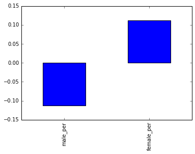
Next we’ll look correlations between gender and SAT scores
1
2
3
| genders =['male_per', 'female_per']
correlations[genders].plot.bar()
|
1
| <matplotlib.axes._subplots.AxesSubplot at 0x7fb21fc27b70>
|
Seems like theres very little correlation overall for both sides small positive correlation for females and small negative correlation for males.
1
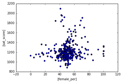
| combined.plot.scatter(["female_per"], ['sat_score'])
|
1
| <matplotlib.axes._subplots.AxesSubplot at 0x7fb21fbee208>
|
Scatter plot doesn’t show much, data seems very scattered and we are not seeing much correlation between schools with more females and SAT scores.
Let’s look at schools with < 60% females and higher than 1700 SAT scores
1
2
3
| schools_with_hf = combined[(combined['female_per'] < 60) &
(combined['sat_score'] > 1700)]
schools_with_hf
|
| DBN | SCHOOL NAME | Num of SAT Test Takers | SAT Critical Reading Avg. Score | SAT Math Avg. Score | SAT Writing Avg. Score | sat_score | SchoolName | AP Test Takers | Total Exams Taken | ... | priority05 | priority06 | priority07 | priority08 | priority09 | priority10 | Location 1 | lat | lon | school_dist |
|---|
| 37 | 02M475 | STUYVESANT HIGH SCHOOL | 832 | 679.0 | 735.0 | 682.0 | 2096.0 | STUYVESANT HS | 1510.000000 | 2819.000000 | ... | 0 | 0 | 0 | 0 | 0 | 0 | 345 Chambers Street\nNew York, NY 10282\n(40.7... | 40.717746 | -74.014049 | 02 |
|---|
| 79 | 05M692 | HIGH SCHOOL FOR MATHEMATICS, SCIENCE AND ENGIN... | 101 | 605.0 | 654.0 | 588.0 | 1847.0 | HIGH SCHOOL FOR MATH SCIENCE ENGINEERING @ CCNY | 114.000000 | 124.000000 | ... | 0 | 0 | 0 | 0 | 0 | 0 | 240 Convent Ave\nNew York, NY 10031\n(40.82112... | 40.821123 | -73.948845 | 05 |
|---|
| 151 | 10X445 | BRONX HIGH SCHOOL OF SCIENCE | 731 | 632.0 | 688.0 | 649.0 | 1969.0 | BRONX HS OF SCIENCE | 1190.000000 | 2435.000000 | ... | 0 | 0 | 0 | 0 | 0 | 0 | 75 West 205 Street\nBronx, NY 10468\n(40.87705... | 40.877056 | -73.889780 | 10 |
|---|
| 155 | 10X696 | HIGH SCHOOL OF AMERICAN STUDIES AT LEHMAN COLLEGE | 92 | 636.0 | 648.0 | 636.0 | 1920.0 | HIGH SCHOOL OF AMERICAN STUDIES At Lehman College | 194.000000 | 302.000000 | ... | 0 | 0 | 0 | 0 | 0 | 0 | 2925 Goulden Avenue\nBronx, NY 10468\n(40.8712... | 40.871255 | -73.897516 | 10 |
|---|
| 187 | 13K430 | BROOKLYN TECHNICAL HIGH SCHOOL | 1277 | 587.0 | 659.0 | 587.0 | 1833.0 | BROOKLYN TECHNICAL HS | 2117.000000 | 3692.000000 | ... | 0 | 0 | 0 | 0 | 0 | 0 | 29 Ft Greene Place\nBrooklyn, NY 11217\n(40.68... | 40.688107 | -73.976745 | 13 |
|---|
| 198 | 14K449 | BROOKLYN LATIN SCHOOL, THE | 72 | 586.0 | 584.0 | 570.0 | 1740.0 | 0 | 129.028846 | 197.038462 | ... | 0 | 0 | 0 | 0 | 0 | 0 | 223 Graham Avenue\nBrooklyn, NY 11206\n(40.709... | 40.709900 | -73.943660 | 14 |
|---|
| 327 | 28Q687 | QUEENS HIGH SCHOOL FOR THE SCIENCES AT YORK CO... | 121 | 612.0 | 660.0 | 596.0 | 1868.0 | Queens HS for Science York Colllege | 215.000000 | 338.000000 | ... | 0 | 0 | 0 | 0 | 0 | 0 | 94-50 159 Street\nJamaica, NY 11433\n(40.70099... | 40.700999 | -73.798154 | 28 |
|---|
| 356 | 31R605 | STATEN ISLAND TECHNICAL HIGH SCHOOL | 227 | 635.0 | 682.0 | 636.0 | 1953.0 | STATEN ISLAND TECHNICAL HS | 528.000000 | 905.000000 | ... | 0 | 0 | 0 | 0 | 0 | 0 | 485 Clawson Street\nStaten Island, NY 10306\n(... | 40.567913 | -74.115362 | 31 |
|---|
8 rows × 160 columns
A google search shows that these schools are heavily STEM focused and have higher entrance requirements, so it makes sense that they have higher SAT scores
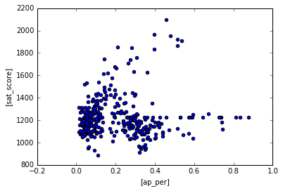
Let’s take a look at AP test takers in these schools. It is possible that AP test takers score higher in SATS.
1
2
3
| combined['ap_per'] = combined['AP Test Takers ']/combined['total_enrollment']
combined.plot.scatter(['ap_per'],['sat_score'])
|
1
| <matplotlib.axes._subplots.AxesSubplot at 0x7fb21f6d4b00>
|
Schools with low AP test takers tend to score low on SAT as well. Wheras schools with high AP test takers generally score higher. This makes sense because students who enroll in AP classes are generally honor students so they study hard for the SATs as well.
Learning Summary
Python concepts explored: pandas, matplotlib.pyplot, correlations, regex, basemap, data analysis, string manipulation
Python functions and methods used: .scatter(), info(), .tolist(), .groupby(), .agg(), .concat(), .apply(), .strip, .merge(), .fillna(), .corr()
The files used for this project can be found in my GitHub repository.